QuickDrain USA
Case study
Problem
From Overlooked To Industry Leader
QuickDrain USA was the true innovator in linear drain technology—offering future-forward, high-performance products that were easy to install, cost-effective, and visually stunning. Yet, despite their superior technology, they were losing ground to competitors with weaker products but stronger branding. Their branding was inconsistent, unfocused, and failed to convey the quality, innovation, and ease of use that set them apart.
Without a structured marketing department, promotion was reactive rather than strategic, leaving QuickDrain vulnerable in a competitive market. The challenge was clear: create a strong, cohesive brand identity and marketing strategy that would secure their position as the #1 leader in the industry. The company then was bought by a larger retailer.
DIGITAL MARKETING | MARKETING STRATEGY | BRANDING | SEO | TRADE SHOW MARKETING | ART DIRECTION | GRAPHIC DESIGN
Solution
Brand Refresh Showcasing Product Innovation
By conducting deep market research, brand positioning analysis, and operational consulting, I developed a multi-faceted strategy that transformed QuickDrain’s presence:
✔ Strategic Brand Overhaul – Created a cohesive, high-impact visual identity that married the technical excellence and aesthetic beauty of the product line.
✔ Messaging That Simplifies & Sells – Reworked technical materials to make complex product information accessible, ensuring that both tradespeople and consumers could easily understand product benefits and installation ease.
✔ Marketing Infrastructure & Growth Support – Established QuickDrain’s first structured marketing platform, providing operational consulting to help the company scale with its growing visibility.
✔ Website & Sales Materials Transformation – Designed a modern, intuitive website and branded content that streamlined the buyer journey, improved engagement, and drove conversions.
The Steps
- Product Design Analysis
- Competitor Research
- Rebranding Needs Analysis
- Design Concept Research
- Design Specifications Defined
- Design Concept Experimentation
- Design Concept Finalized
- Branding Assets Created
- Existing Marketing Materials Updated
- Website Redesign
the Outcome
Industry Recognition, Market Leadership
✔ Achieved the #1 spot in the linear drain industry, securing QuickDrain’s position as the go-to brand.
✔ Increased industry recognition, with the brand becoming a key driver in high-end and ADA-compliant bathroom design trends.
✔ Sales surged, as the refined messaging and branding resonated with both contractors and consumers, driving adoption of QuickDrain’s technology.
✔ Created a lasting competitive edge, with the new brand positioning still influencing industry trends today.
By combining bold branding, clear messaging, and structured marketing strategy, QuickDrain elevated from an under-branded innovator to the undisputed industry leader—proving that even the best products need powerful storytelling and smart strategy to thrive.
Branding – Before
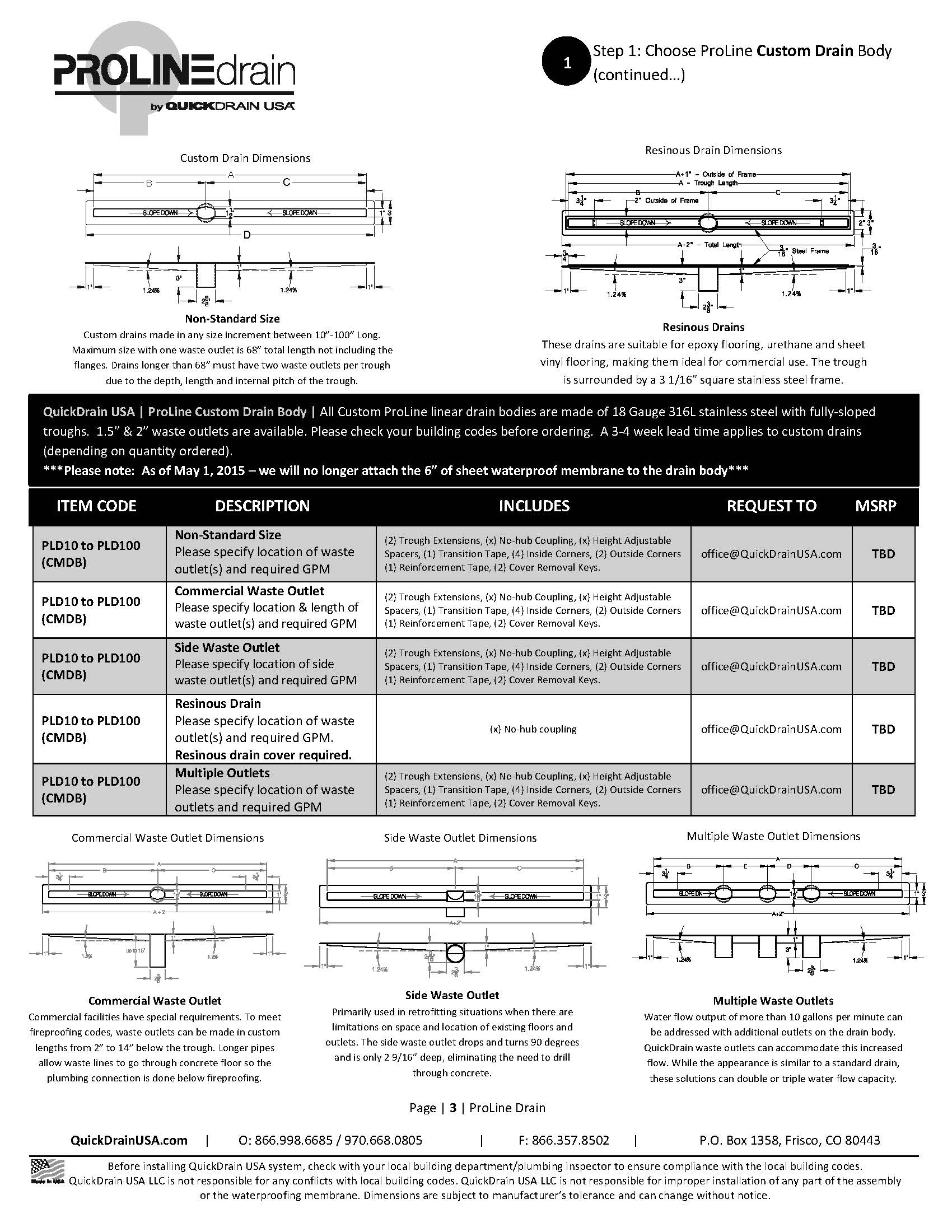
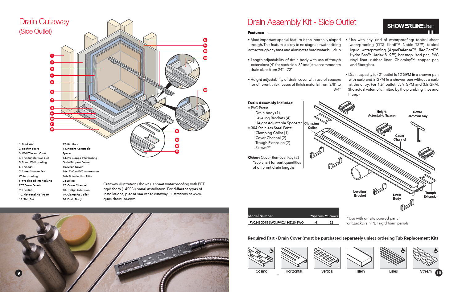
The old price list was difficult to understand for homeowners AND contractors. It was dry, technical, and uninspiring. It did not make it easy to understand the differences between product lines.
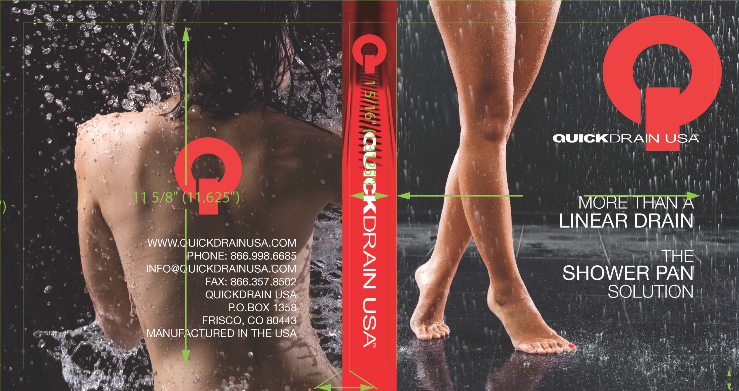
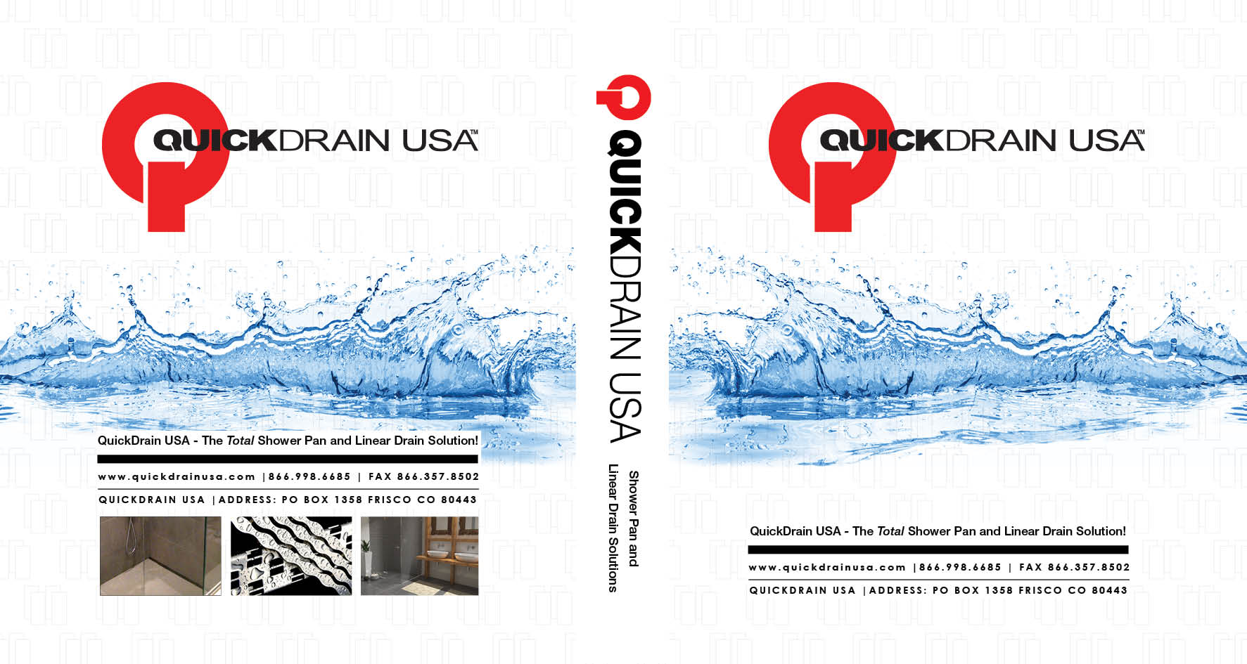
Sales materials, such as this binder had several problems. It did not showcase any of the products. The picture of the woman cut in half on front and back felt awkward and sent the wrong message. Without already knowing the company, it would be impossible to guess what the company sells.
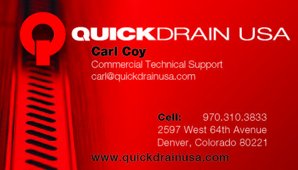
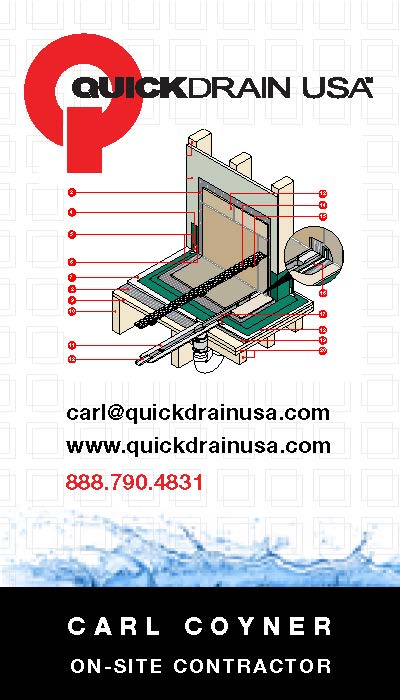
The business cards did show one of the products. However, with the strange red overlay, it made it difficult to understand the object is a shower drain. Many people interpreted the red color as “bloody” and did not understand. Also, the layout is awkward.
Branding – After
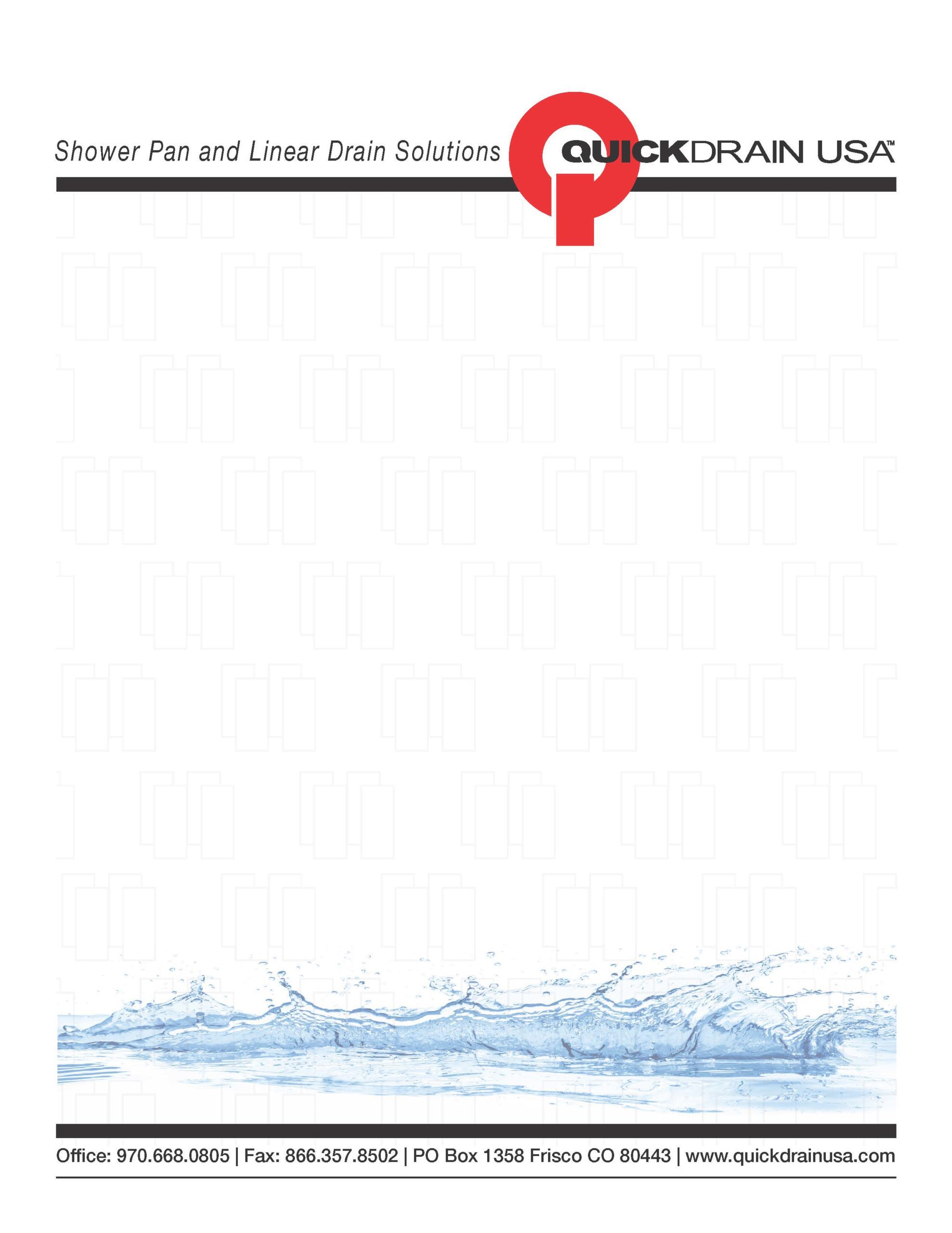
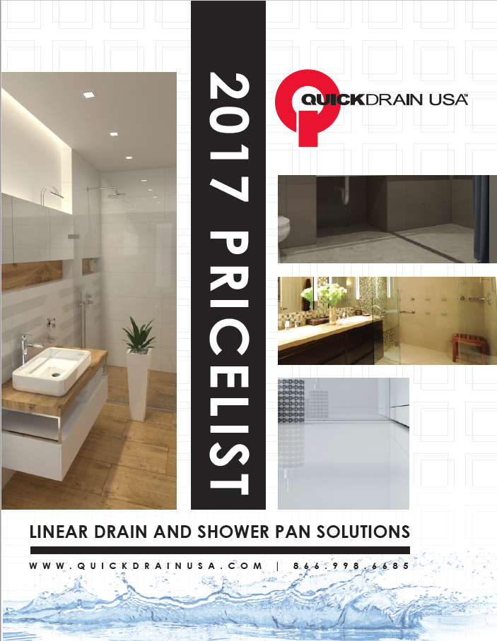
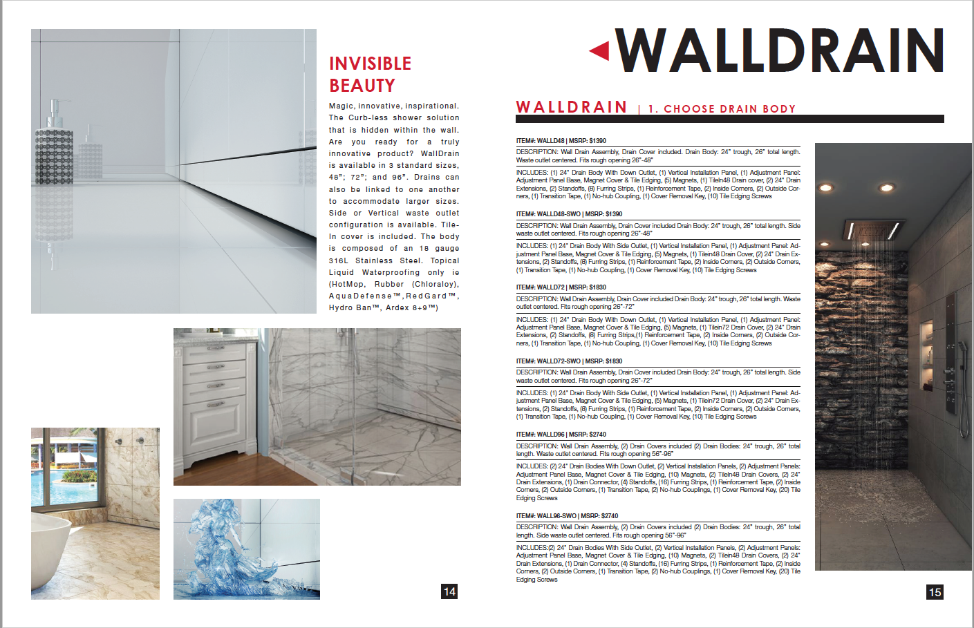
The new brand concept focused on the visual and technical beauty of the products. The clean simple design reflects the products ease of installation. Technical details are easier to absorb. The use of white space and clear water reflect the powerful hygienic benefits the product provides.
The new price list is streamlined, readable with supporting visuals. Technical information is concise, ordered, and friendly.
The new business card is fresh, engages the eye, is friendly and easy to read. The sales binder is attractive and stands out among other materials on a rack. The new branding makes the company name and logo stand out and recognizable. In the old branding the logo was always lost.
